CliffsNotes’ first subscription
After acquiring CliffsNotes, we decided it was time to bring the well-known brand into the 21st century with their first subscription since it started in 1958. We were building this to see if our currently subscription model would entice users to sign up. When we started offering guides as PDFs was enough to get subscribers. We leveraged using existing components on LitCharts and updating their styling to streamline designs for CliffsNotes. We developed a strategy through competitor analysis, stakeholder workshops, user flows and understanding as many edge cases to launch this project.
Role: Product Designer
Scope of Work
Stakeholder workshop w/ cofounders
Competitor & Research Analysis
Wireframes
Iterative design reviews
Low & high fidelity prototyping
Collaboration w/ dev team
QA testing
How can we add a subscription minimally to a legacy product?
Integrating this design into the current site was the goal of this build. An intuitive usable solution that would communicate clearly to potential subscribers the value of their subscription. We first dove into the hypothesis we were trying to test: would people even subscribe for a CliffsNotes subscription? How can we clearly highlight the value of it? After conversing with stakeholders, we developed the following user flow to capture all use cases:
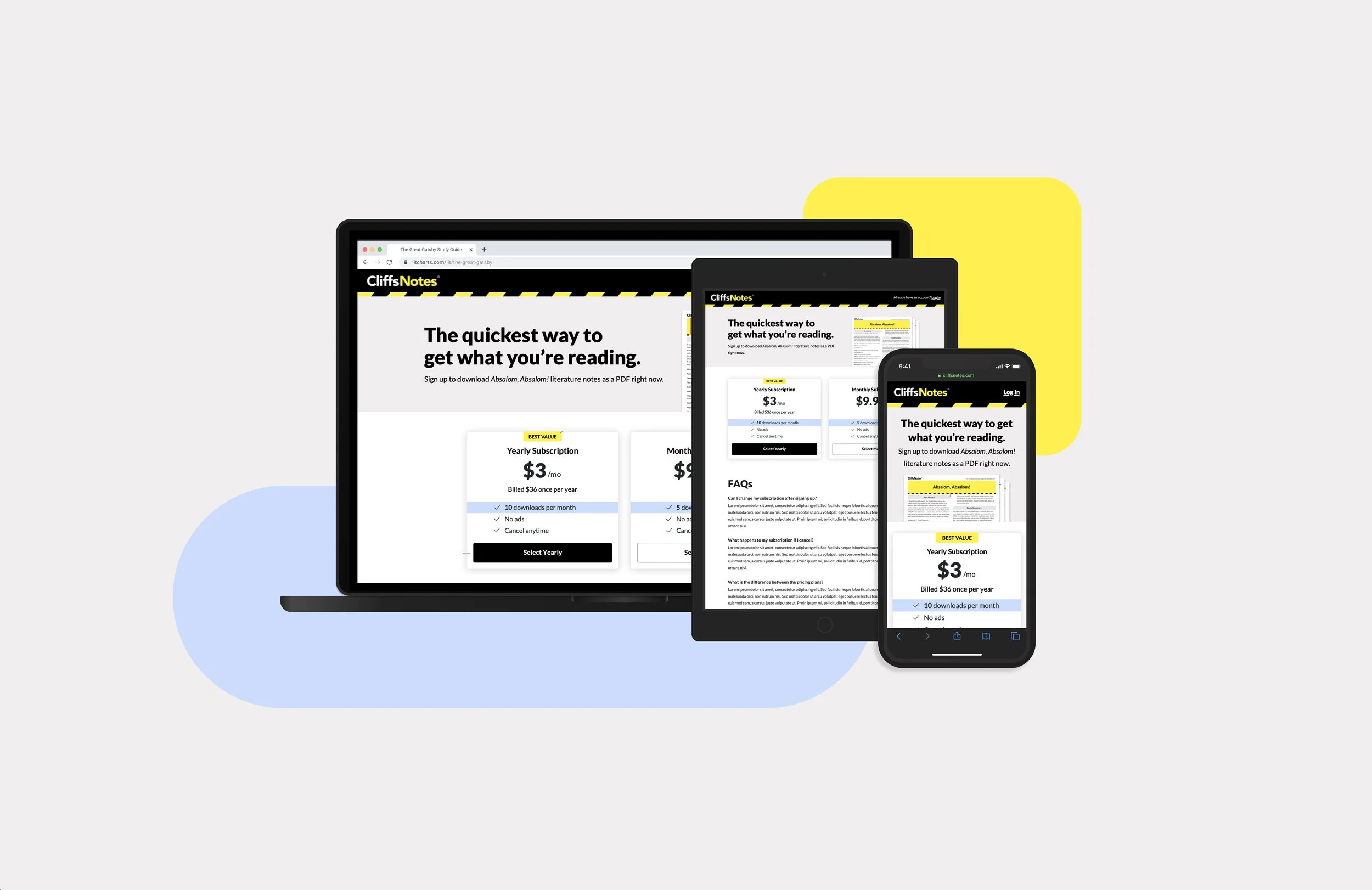
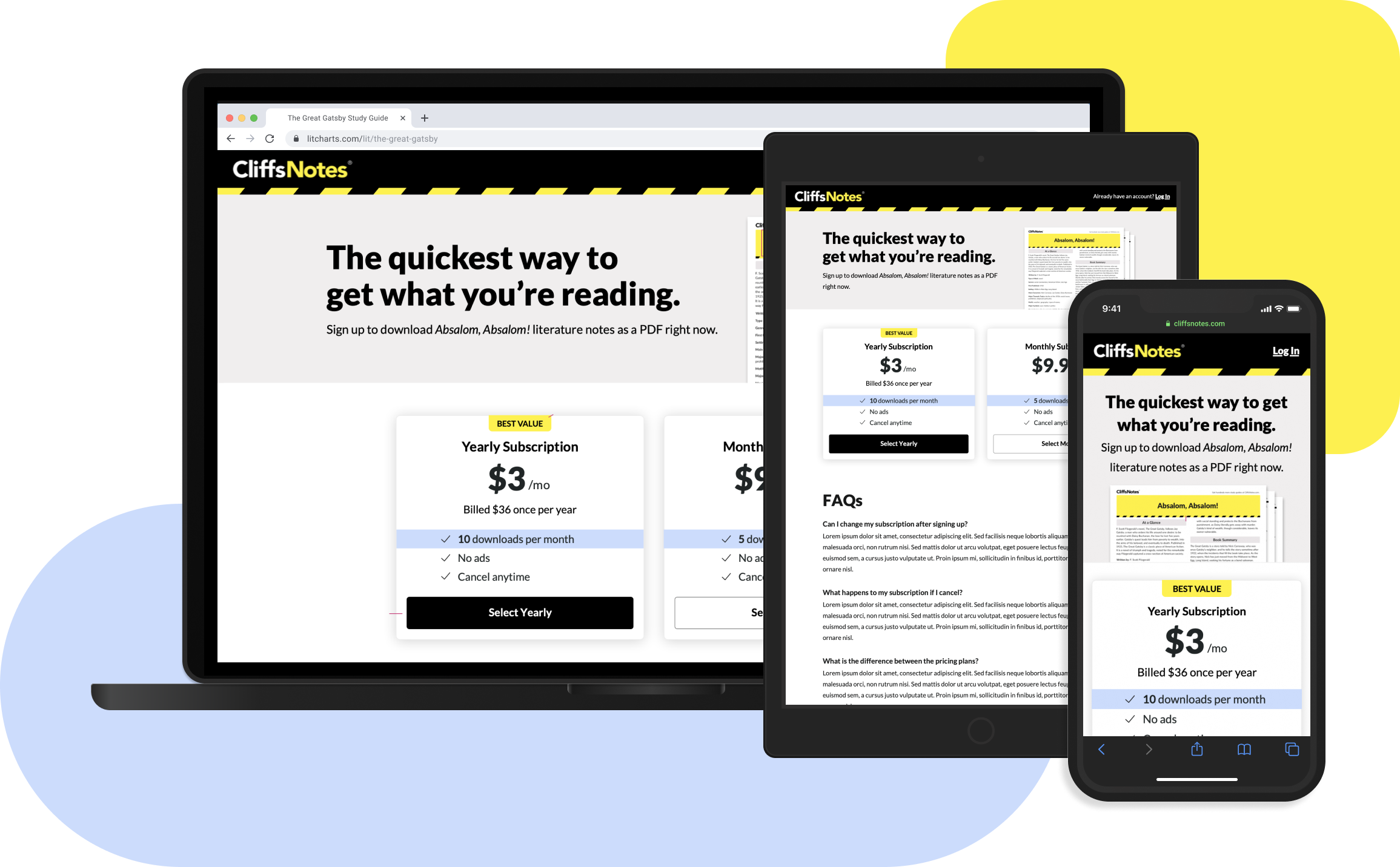
The Making of CliffsNotes’ First Subscription
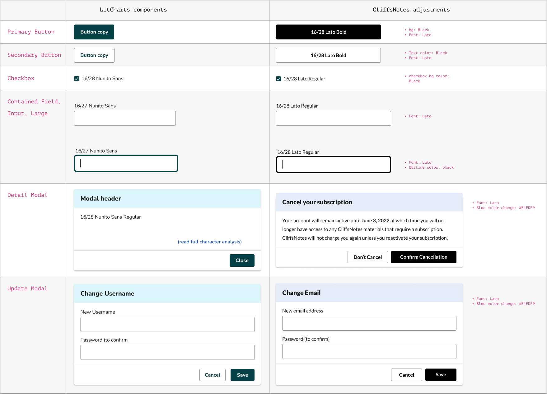
As this was the first subscription on CliffsNotes, we used an existing component library used on another site and translated components to match CliffsNotes UI language. This tactic ended up saving us development time to launch the project quickly.
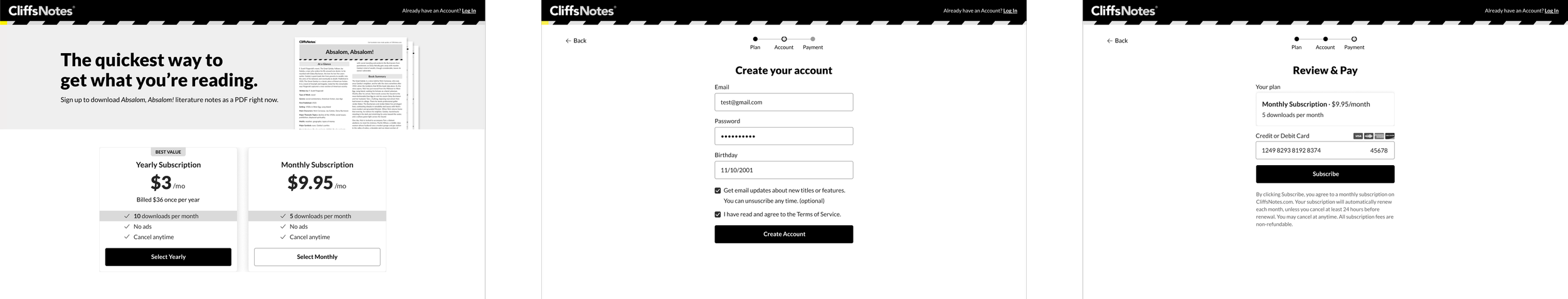
Design wise, we ended up adding certain navigation elements to help the user know where they were in the process. In this sell page we added a multistep process where the user would first create an account with us then be able to check out. This insured that even though users abandoned the flow, we would be able to flow up with marketing to seal the deal.
Applying Research
Given this analysis, strategy, and flow mapping, we developed the following high fidelity designs. After iterating on different UI elements like stepper and plan cards. The following are final designs for the MVP subscription flow.
Moving Forward
Beyond the subscription launch, we have run multiple A/B tests to improve the subscription flow. We will be continuing to implement these to improve this flow incrementally. Before joining, the team was not familiar with optimize and what it could do. After successfully advocating for research tools such as optimize, we have seen an increase in subscriptions with each test. Hoping to continue this trajectory with this new system set in place.
There are many more exciting improvements on deck, feel free to browse the site in the meantime!