abc carpet & home Redesign
As the Lead Product Designer on the product detail page redesign, I partnered closely with the PM, an external agency, and cross-functional teams to strategically drive the end-to-end design.
Impact
81% revenue increase validated by A/B test
55% increase in average order value
Conversion rate lifted from 0.56% to 0.65%
Designed with engineering in mind, reducing friction across teams
The Challenge
Redesigning the product detail page was a top priority for abc carpet & home leadership. Since their products are high-consideration purchases with average order values over $700, users needed more reassurance throughout the buying journey to convert. Senior leadership framed it simply:
“How might we improve shopper confidence to buy high-consideration products online?”
Research
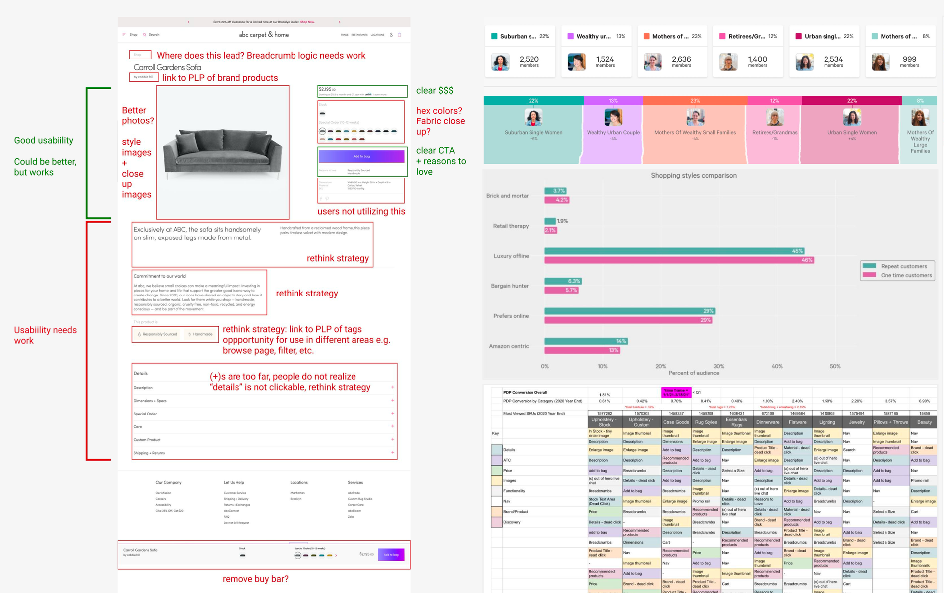
I proactively created a detailed research tracker outlining responsibilities. This kept the project efficient across an in-house and an external teams.
Three findings shaped the redesign:
FullStory revealed that the most-clicked items on the existing page were at the bottom
Personas and conversion data clarified who our target audience was and where they dropped off
Competitor analysis surfaced patterns in how other high-consideration retailers built trust
Together these defined a clear brief: elevate the high-value items to the top fold, and reduce flow friction.
Ideation: UX Strategy
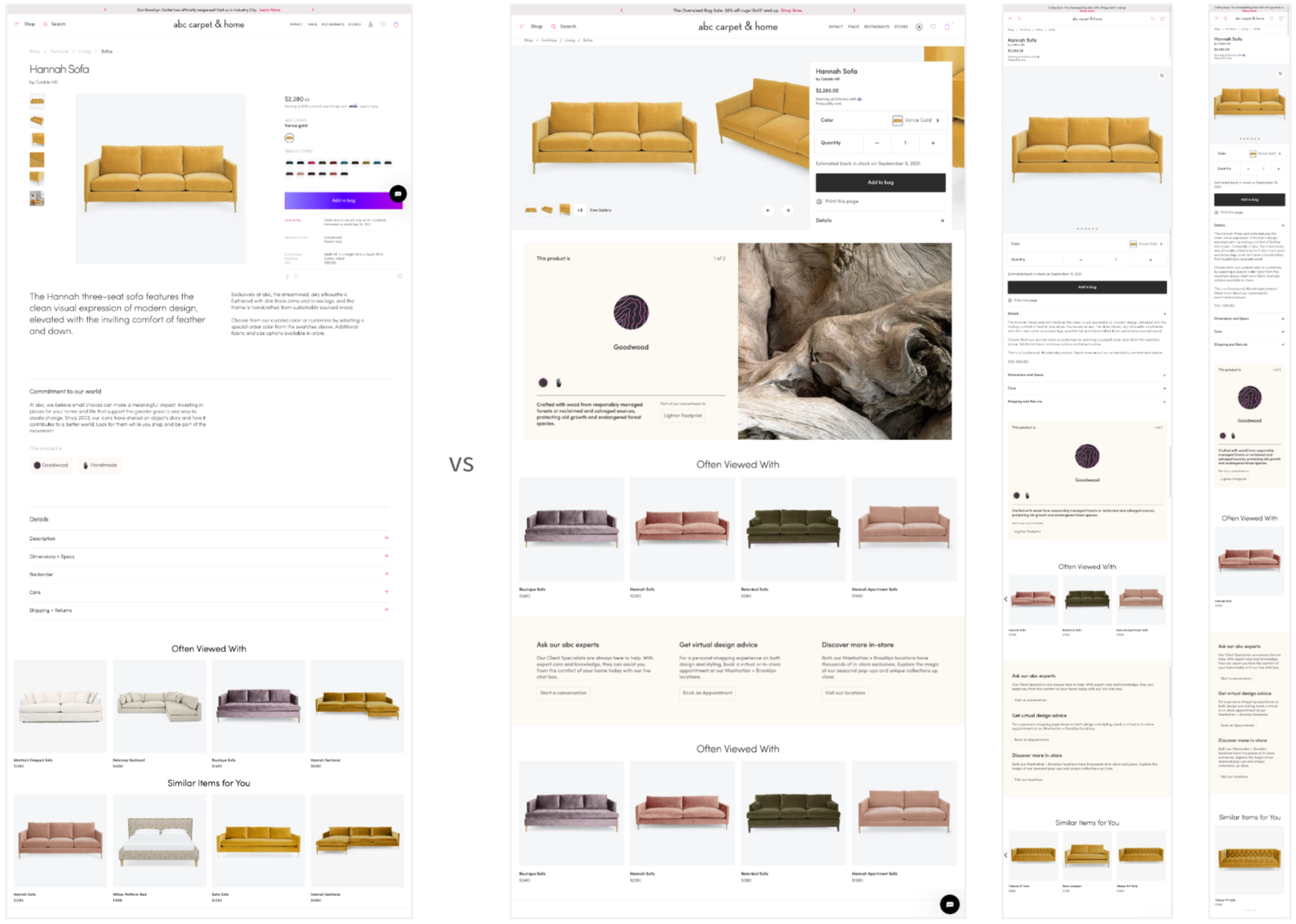
Based on the research, I defined the overall structure and UX strategy for the redesigned page. I iterated on multiple strategic approaches, presenting variations to stakeholders, evaluating pros and cons of each direction, and aligning on what best supported the brand and the buyer's journey:
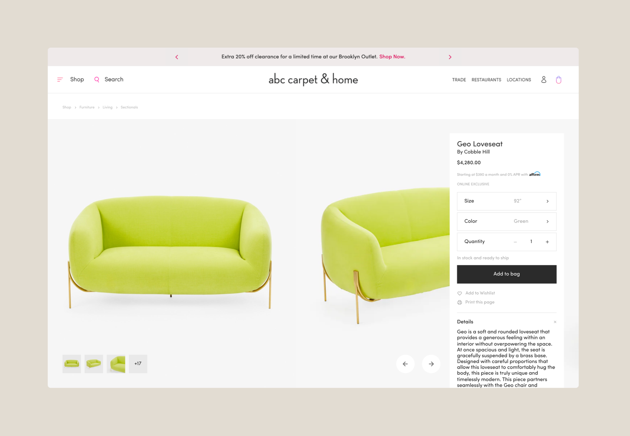
Hero — imagery, details, specs, and add-to-cart elevated to the top fold
Inspiration — lifestyle imagery and unique selling points
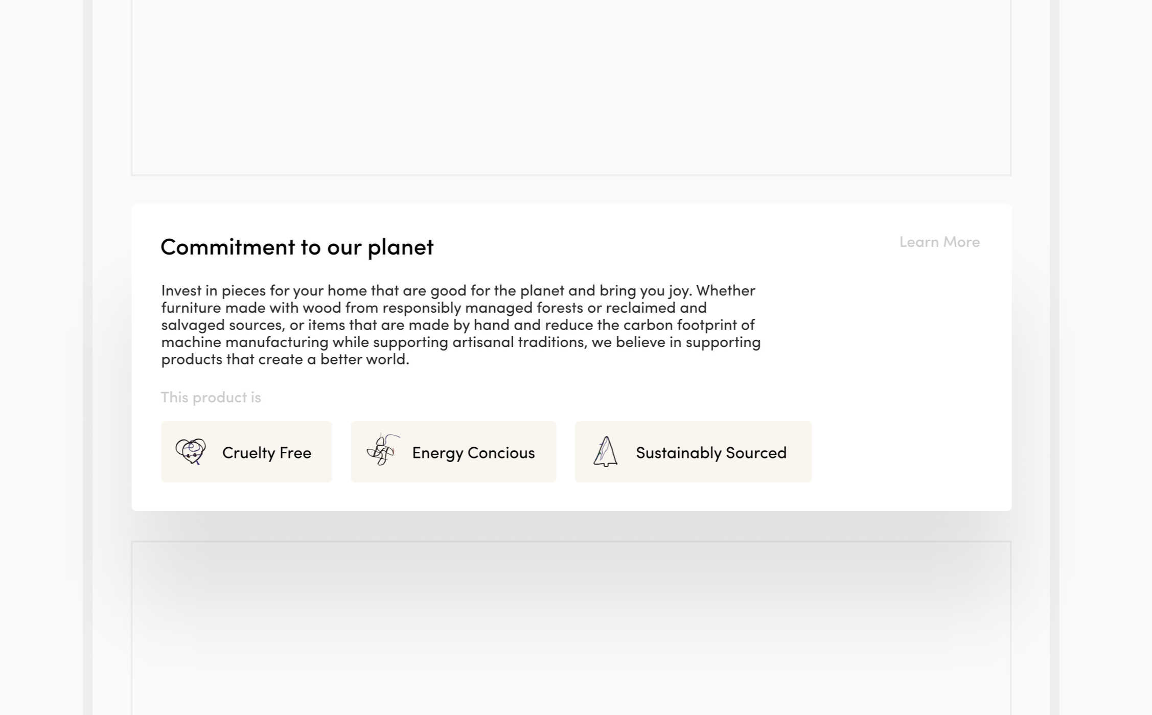
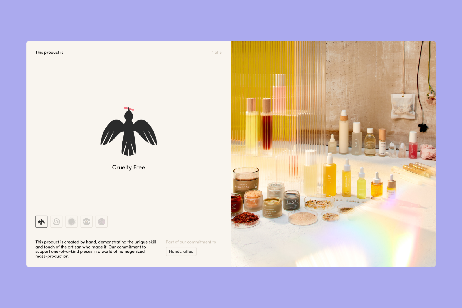
Storytelling — brand values and sourcing story
Discovery — recommendations and customer service
Ideation: UI explorations
Throughout this process I led the design effort: guiding and iterating with the agency's design engineer, providing feedback, and ensuring the work was optimized for build.
We agreed that an A/B test would be the most effective way to validate the direction, and I advocated for it with stakeholders to secure approval before moving into build.
A/B Test Results
Once the designs, data, and content were fully approved, I led the handoff and partnered with the agency to bring the vision to life. The build required extensive QA and close cross-team collaboration.
After running the test for just over two weeks, the results were clear:
Revenue increased by 81%.
Average order value jumped 55%.
Per session value nearly doubled.
With equal experiment sessions on both sides, the results were unambiguous — the redesign based on user-centered thinking was a measurable success.
Reflection
The numbers validated the approach, but the process made them possible.
Thoughtful phasing matters: moving too fast early meant scrambling at launch. Front-loading alignment saves time at the back end.
A/B testing is only the beginning. Phase two is where the real work lives: refining the design and improving usability based on what the data surfaces.
Designing with engineering in mind accelerates delivery: designs that align with how components are coded reduce friction from day one.