Peloton HQ—office design
Peloton is an exercise equipment streaming service that seamlessly blends together digital and physical space. I worked with an amazing team at A+I to design Peloton’s Headquarters. The challenge was to build their future workplace set to house 3 times its current size. Through careful design and consideration of our many users, we developed Peloton’s new home.
My Role:
Designer (Architecture & Strategy)
Scope of Work:
User research & office analysis
Brand strategy & future vision
Concept & design development
3D models, diagrams & renders for client meetings
Design, construction drawings, detail development & submittals
Coordinating with engineers & consultants
Diving In

The architecture process is much like the double diamond approach. We begin by kicking things off with an in-depth study of the user, Peloton’s staff, to understand their mission and future vision. To take this on, we observed their existing headquarters, and interviewed an array of leadership, and staff to understand who they are, what they need, and how the headquarters can best serve them. In total, we interviewed 37 people, and received 186 survey responses .
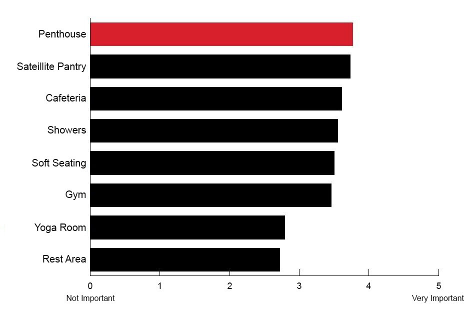
“Community is what defines Peloton, it’s why people want to work here.”
Applying Research
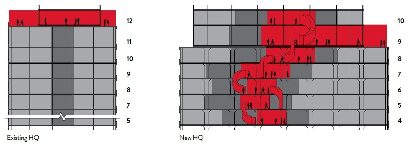
Building upon data collected, we held an office-wide workshop to iterate a series of possible design directions. After iterating further, we synthesized this process and landed on the concept of the vertical penthouse— a distribution of amenities to all floors rather than their current setup which reserves them on one floor.
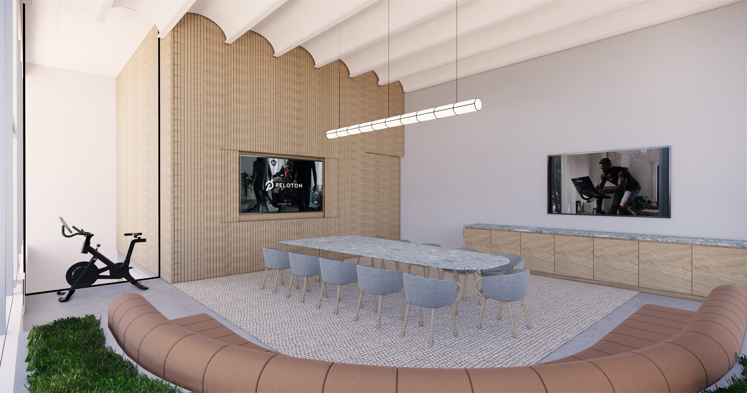
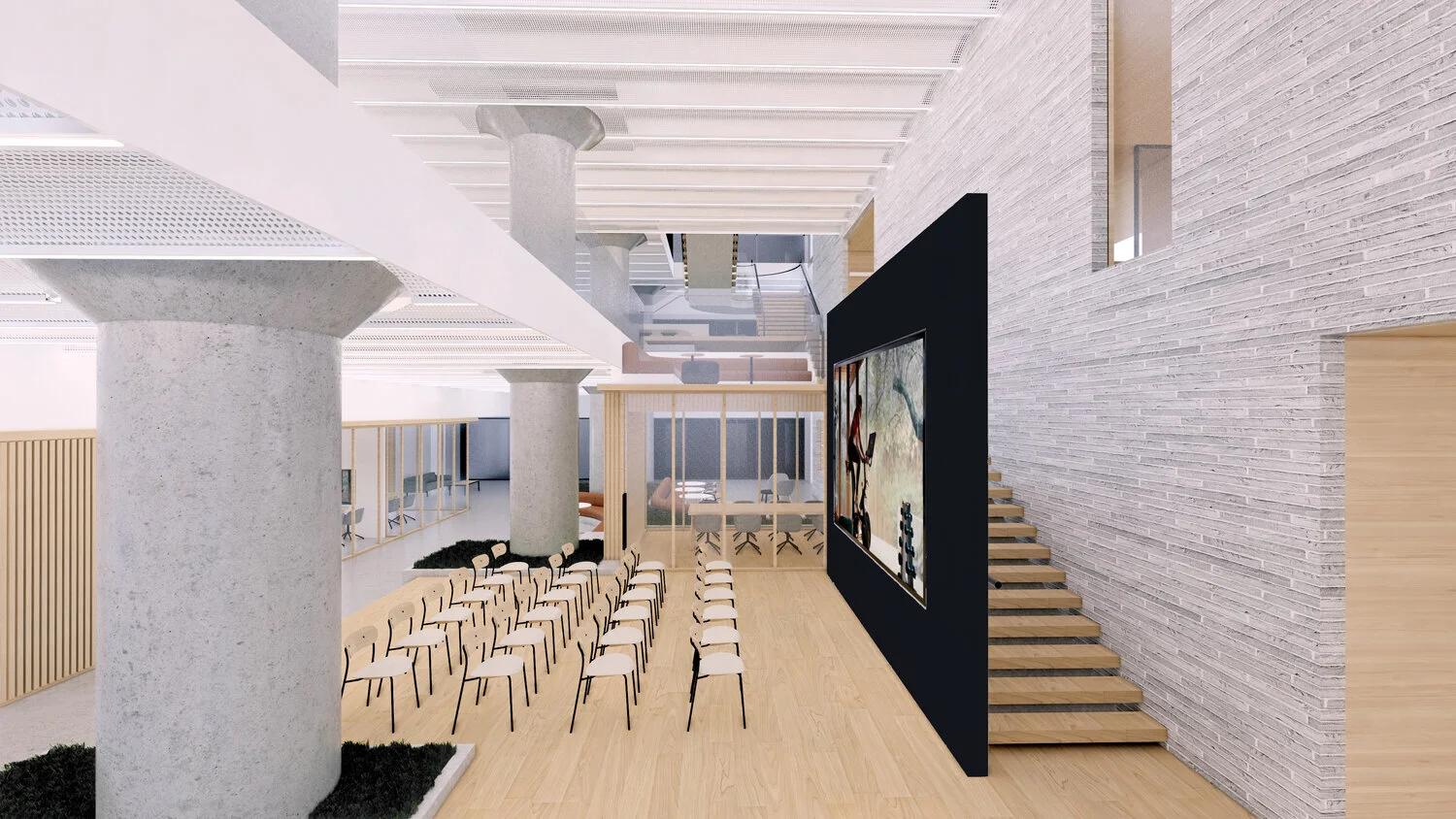
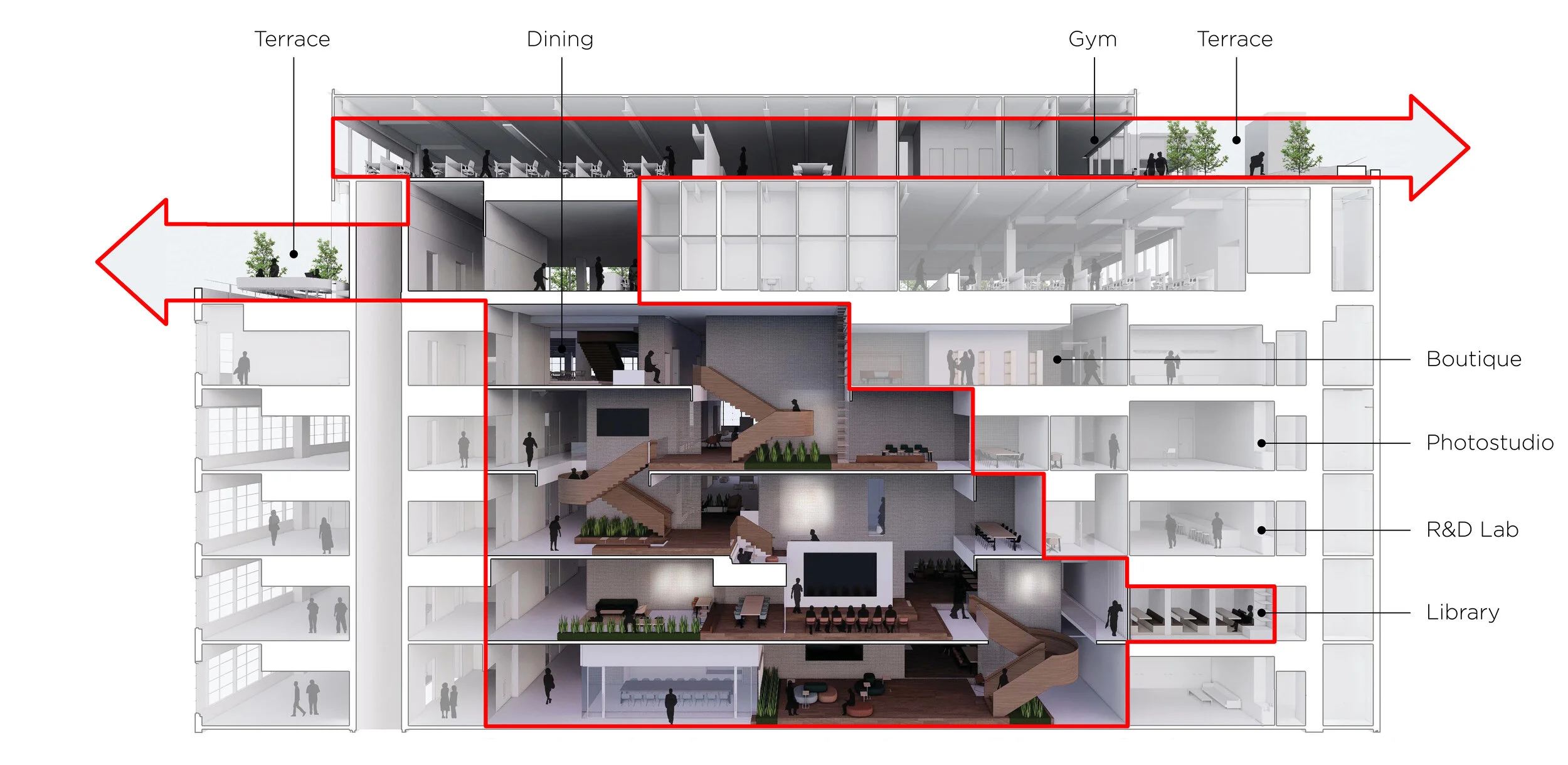
From here, we began to develop concept into more detail— iterating/producing 3D models, drawings, and renderings. Below builds upon the concept diagram above, it showcases a section render exploring materials, amenities, connections, and detail design development.
Brand Strategy
Beyond architectural brand elements (naming conventions, logos, etc.), digital integration was essential to create a cohesive space. We pitched a mobile app that could support navigating the new headquarters and promote community.
Due to a tight schedule the app idea was set on pause, but the content templates for monitors and televisions were integrated. The following site map was created using online card sorting data collected from 12 participants.
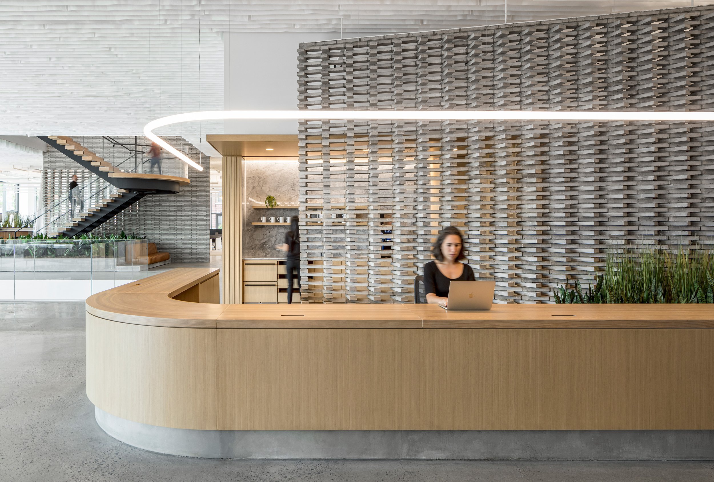
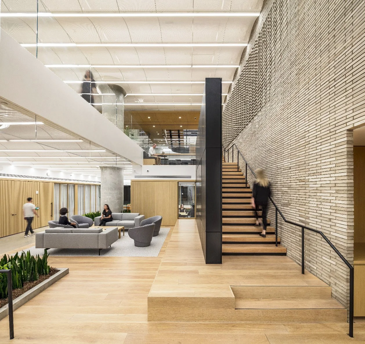
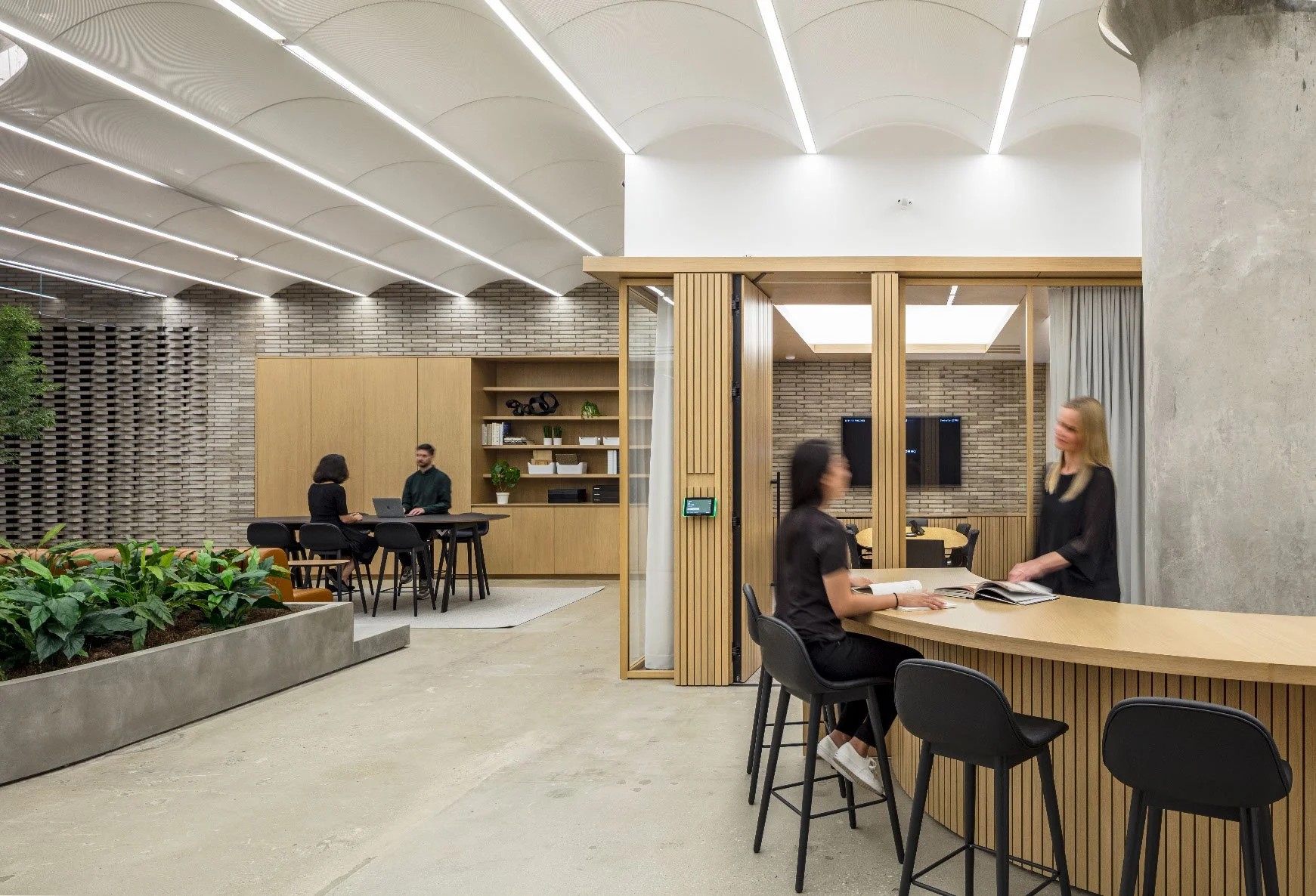
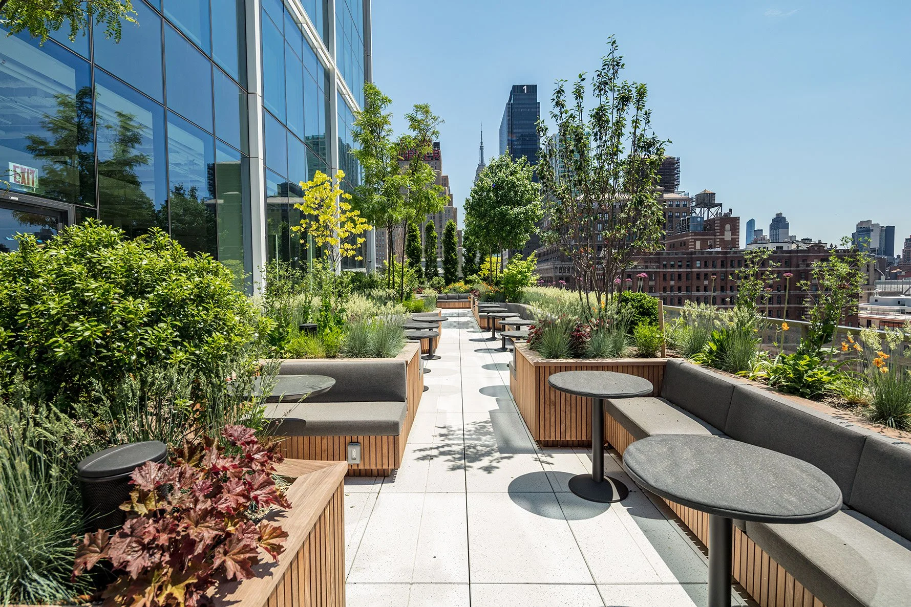
Now Built
Overall in collaborating with a diverse group of consultants ranging from acoustical to landscape, we holistically developed all the project’s components in tandem. From curating plants, customizing furniture, cafe smells to welcome visitors, no detail was left unconsidered.
A main lesson learned from this process was balancing broad vision with attention to detail. This allowed me to use my time more efficiently, to know if I needed to put in effort or send it back to the engineer, if it didn’t provide enough information in the first place. Through thoughtful design and consideration of our many users, we were able to create a space that provides amenities equally on all floors while uniquely supporting each department’s diverse needs.
To see more, visit Architecture + Information.